Rocket Mortgage- The Key lead Allocation Software
My Role
As the Senior Experience Designer for the Key, my responsibilities included designing all features, conducting research, facilitating user interviews, and leading workshops. I collaborated closely with product and engineering teams to ensure the best experience for our team members. This involved conducting UX audits and journey mapping to inform the design process and produce all necessary artifacts for implementation.
User Needs
Using Tools Efficiently: Production strategists must juggle multiple tools, but it's not always easy. Access to diverse tools is crucial for gathering reliable data.
Trust in Data: Data reliability is vital. Production strategists should cross-check information from different sources to ensure accuracy.
User-Friendly Tools: Intuitive tools are a must. They should be straightforward and suitable for newbies and seasoned pros.
Simple Language: Keep it simple. Plain language and clear features help reduce the learning curve for newbies and ease the workload for experienced strategists.
Testing and Experimentation: Flexibility is vital. Production strategists need tools to test different strategies and hypotheses and refine their approaches effectively.
Solution
Replacing Legacy Software: The Key replaces the Legacy Software Loan Origination/Lead Allocation (LOLA), consolidating various functions into a single application.
Features: The Key offers historical data, alerts, and call-outs and facilitates quick testing and troubleshooting.
Personalization: Production strategists can personalize their data by favoriting items, reducing cognitive load through sorting and filtering, and providing a centralized source of truth for data.
Visual Hierarchy for Configuration Warnings: The Key employs a color visual hierarchy to warn production strategists about configuration errors, ensuring they are promptly alerted to incorrect settings.
Logs and Historical Data: The Key also provides logs and historical data, allowing production strategists to confirm configurations and track changes over time.
Feedback
““Less room for error in escalation with the Key””
““This is much simpler than LOLA.””
•Users liked personalization features like displaying profile pic and viewing in dark mode.
•Users trusted the data in the application
•Users found the essential efficiency in achieving their goals
Methods
• Conducted a working study in the first quarter of 2023 Via one-on-one in-depth interviews and task observations with the production strategist.
• I conducted a UI/UX audit and added defects to the product backlog.
• With Multiple rounds of user studies were completed. I regularly shared and socialized user studies, creating a culture of empathy across the product and engineering teams.
Who?
• Production Strategists are at the beginning of the sales funnel, a highly specialized group working on multiple channels and sub-specialties. Lead strategy and management vary by specialty.
• Strategists have a data-heavy view of having to make decisions and not knowing the impact of their configurations until it is too late.
• They have a decentralized experience that requires them to look at and interpret multiple data sources that are sometimes conflicting.
User Inetrviews
UX Audit Completed a comprehensive audit that included a heuristic review, Task Analysis and user feedback. We were able to fold the findings into the backlog.
Banker Profile Page Enhancements to the banker profile allow production strategists to monitor banker performance and adjust capacity as well as troubleshoot.
Routing Rules warning: Immediate feedback is given to users when settings are misconfigured, allowing them to have peace of mind and not wait for results, risking a negative impact.
Favorites: Users wanted the ability to favorite opportunity groups, decluttering their view, allowing them to focus on what is important to them and their specialty.
Data display enhancements: Giving the production strategist new ways to visualize data, linking Data points offers a centralized place for a source of truth without jumping from system to system.


““Would be great if we have a tool tip or hover over telling what the columns mean.””
““I want to see my Opportunity Groups.””
Future
•Users suggested using simple language, avoiding technical terms, and wanted cues on the
column headers, loan status, Opportunity Groups
•Users wanted options that would help reduce scrolling
•Users requested the ability to search by multiple fields like Common ID, Banker,
•Users suggested personalization of the Opportunity Groups grid to reduce cognitive load
“I want to see my Opportunity Groups.”
•Users wondered why they couldn’t delete an OG and wanted the ability to delete an OG
State Farm- Design System Digital Experience Library (DXL) - Unifying Brand Consistency and Accelerating Production
My Role
As a User Experience Architect on State Farm's Digital Experience Library (DXL) team, I played a pivotal role in architecting elements strategically deployed across State Farm's digital properties. Over the course of four years, my role involved addressing significant challenges faced by State Farm in maintaining brand consistency across its diverse digital platforms. Multiple teams and disciplines within the organization struggled to align their design efforts, leading to inefficiencies, more prolonged production cycles, and a fragmented user brand experience. To tackle these challenges, I led the development of the DXL project, focusing on revolutionizing brand consistency and accelerating production. This case study showcases my contributions to the project, detailing how DXL transformed State Farm's digital ecosystem.

A progress indicator is a visual UI element that visually represents the completion status of a task or process, using a bar for state farm Users to track claims and processes.

The Digital Experience Library (DXL) was conceived as a solution to these challenges. Here are the key aspects of its implementation:
Architecting Elements: In my role, I played a crucial part in architecting design elements that could be used consistently across various State Farm properties, spanning Marketing, Neighborhood of Good, Simple Insights, B2B and B2C sub-sites, and vendor areas.
Research and Visual Design: I conducted research and, in some instances, directly contributed to the final visual design of these elements, ensuring they aligned with State Farm's brand guidelines.
Library Launch: I was part of the team that successfully launched the DXL. We selected the right tools to host the library and devised a strategic plan to execute the project efficiently.
Molecular Design Foundation: The DXL was built on the foundational principles of molecular design, breaking down complex design components into modular, reusable elements.

Results:
The implementation of the Digital Experience Library (DXL) has yielded significant results:
Efficiency Gains: Product teams now utilize DXL to design more efficiently, streamlining their workflows and saving time.
Agile Design: Teams can work in an Agile manner, creating wireframes and prototypes in hours rather than days.
Production Acceleration: Time from concept to production decreased by over 50% with the new process.
Unified Brand Experience: DXL enables a unified enterprise brand experience across all State Farm digital properties.
Conclusion:
By creating the Digital Experience Library (DXL) and embracing molecular design principles, State Farm has achieved a consistent, repeatable, and enterprise-wide design system. This not only unifies the brand experience but also significantly reduces time to production, allowing sites to go live faster and more efficiently. The DXL project represents a substantial step forward in enhancing brand consistency and optimizing design processes across State Farm's digital ecosystem.
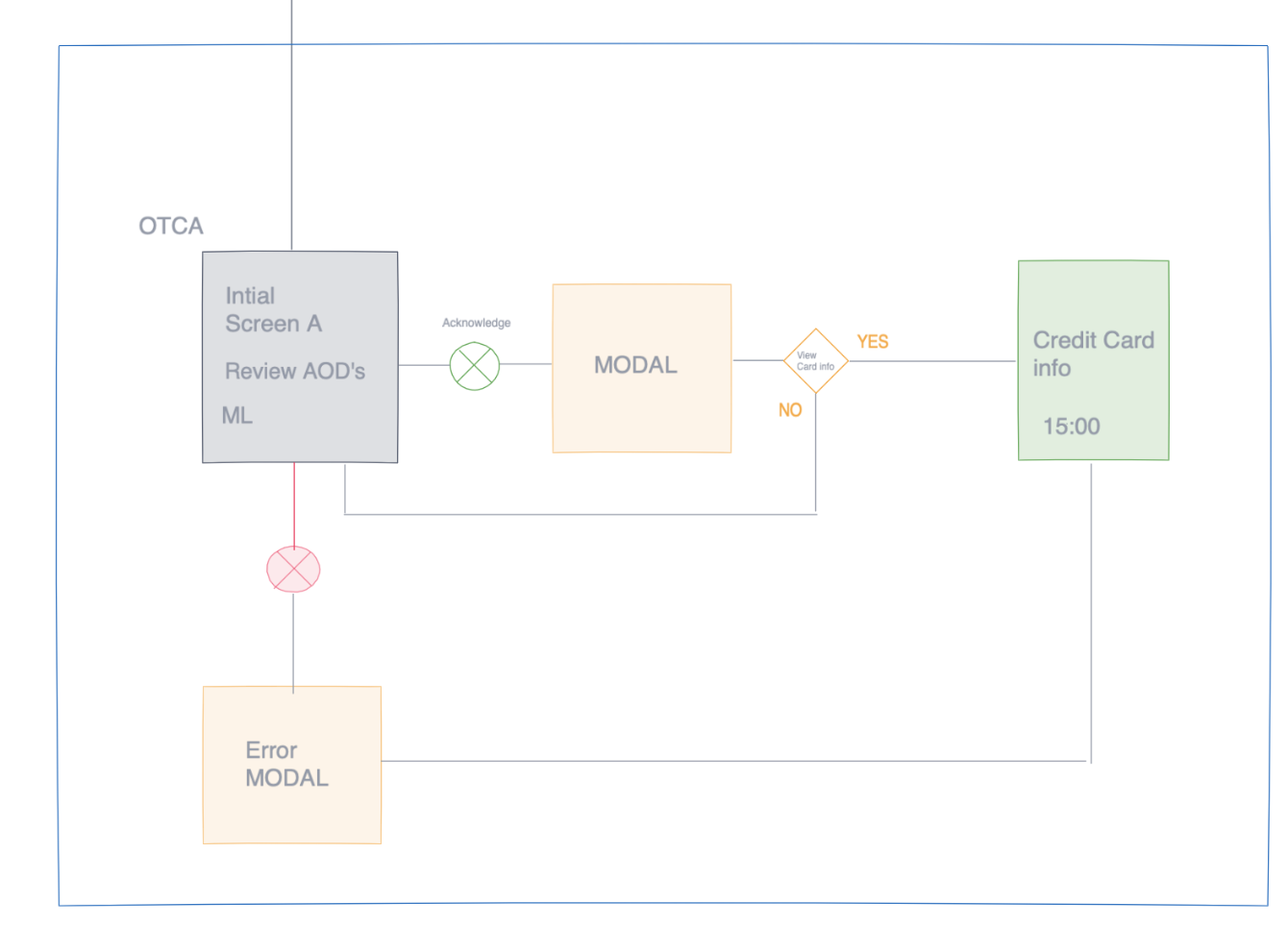
State Farm- One-time new card access to customers' State Farm credit cards
As a product designer, I took the lead in architecting the flow and designing the UI for a new card access feature. This involved conceptualizing the user journey from start to finish and crafting the visual interface to ensure a seamless and intuitive experience.
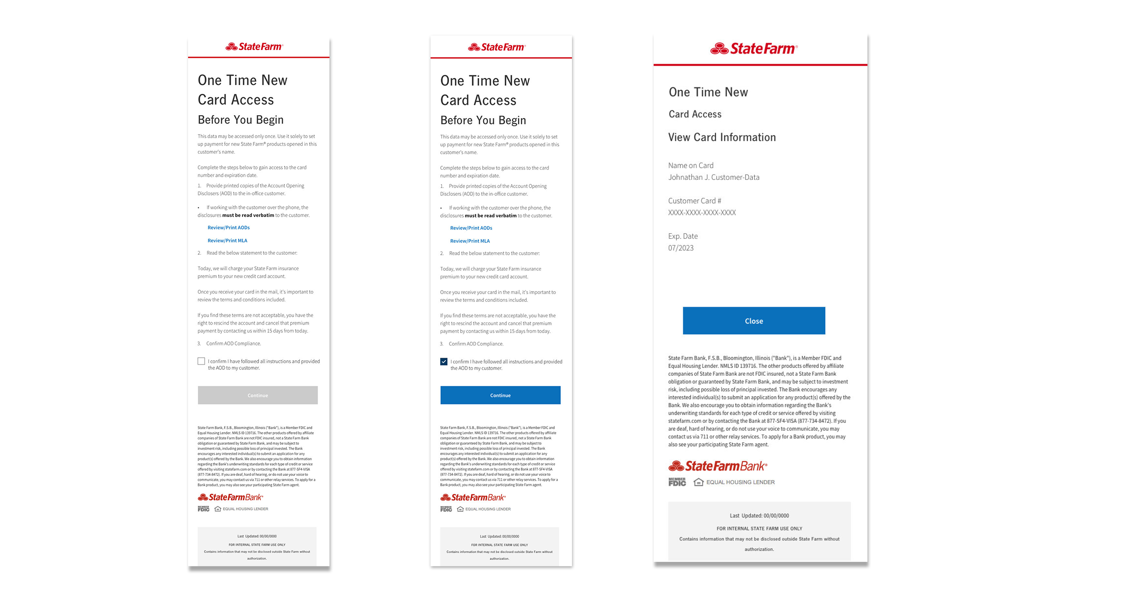
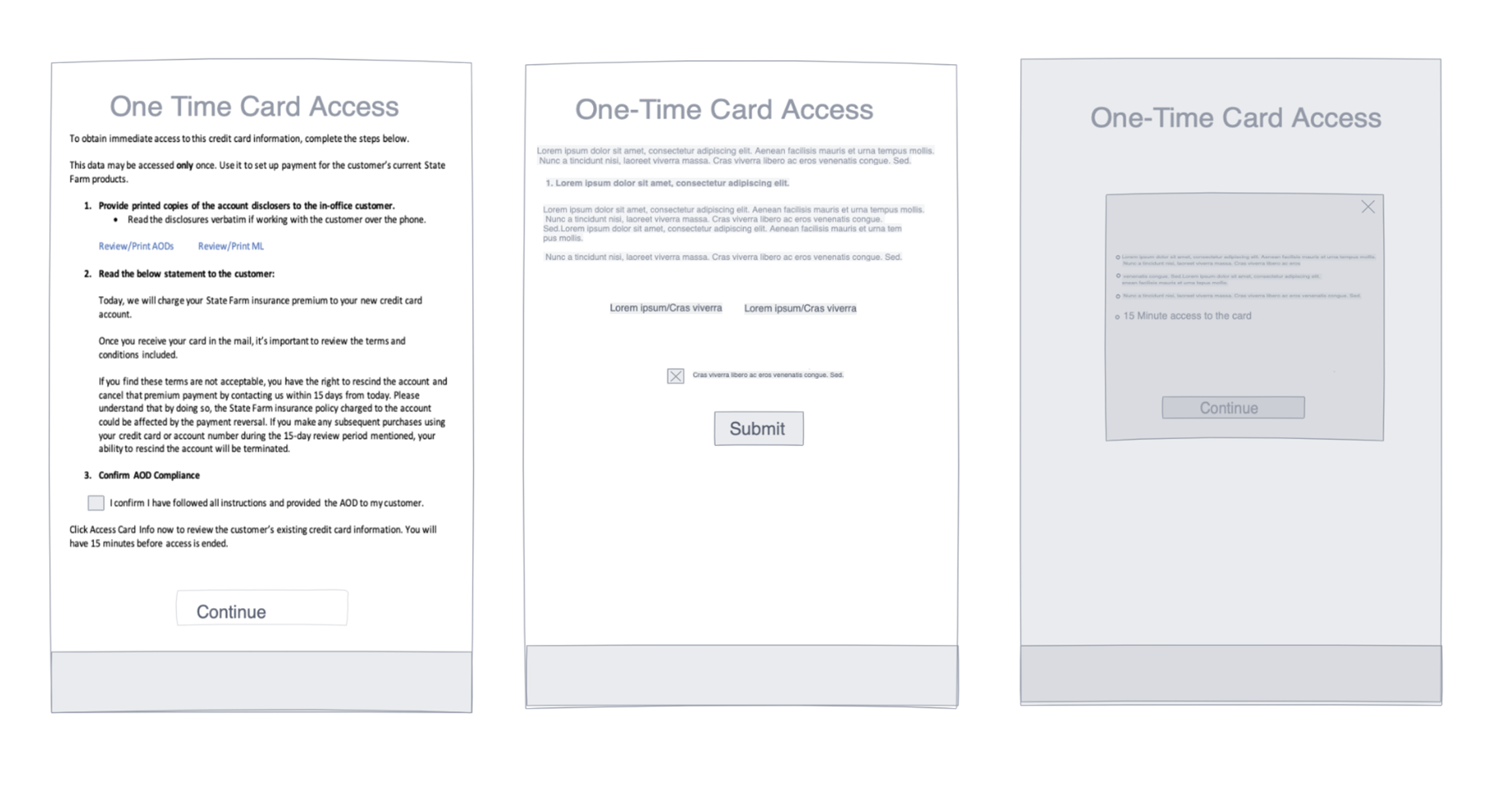
The goal was to boost auto payment enrollment and reward customers with points on their State Farm Reward cards.
The initiative exceeded expectations, resulting in a remarkable 43% increase in auto payment usage.
This increase effectively reduced the number of missed payments and policy lapses.
Customers benefited from earning reward points, which can be used for future purchases or discounts.
The initiative creates a win-win situation, incentivizing auto-payment enrollment while providing added benefits.
More customers using auto-payment leads to a more efficient and streamlined business process.
State Farm - Customer Claims Journey Map
I researched customers' pain points when filing homeowners insurance claims with State Farm. Despite its diverse insurance offerings, the claim process could be complex and overwhelming for customers during difficult times. Our research aimed to build empathy and gain insights to improve the claims process.
The outcome was a detailed customer journey map covering the entire process from incident occurrence to claim resolution, providing valuable guidance for enhancing the customer experience.
.
State Farm -Khaki Revolutionizing Insurance with Voice Assistance
Our mission was to simplify insurance complexities in a time-crunched world. Khaki emerged as our digital companion and was integrated into the State Farm mobile app and smart speakers like Alexa. It intuitively aids users with insurance inquiries, simplifying intricacies. As a storyteller, I crafted engaging narratives, leveraging animation, to illustrate Khaki's transformative impact on users' insurance experiences during rapid digital innovation projects like hack days.

Weather Channel
My Role
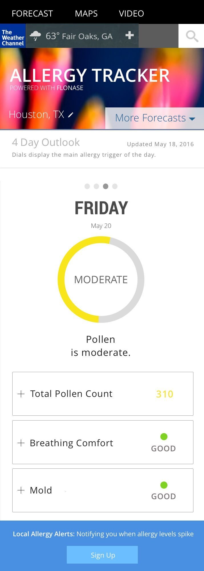
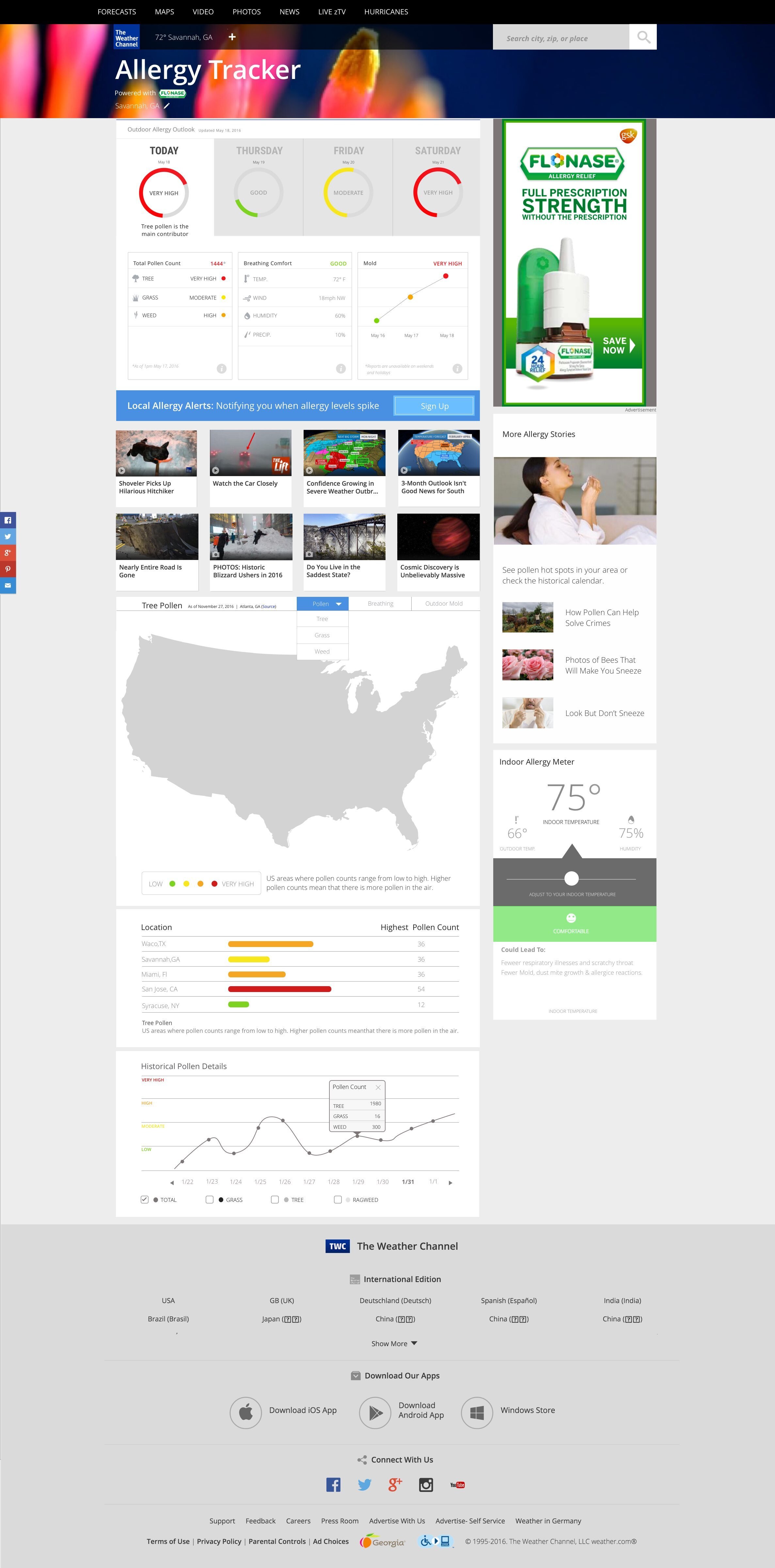
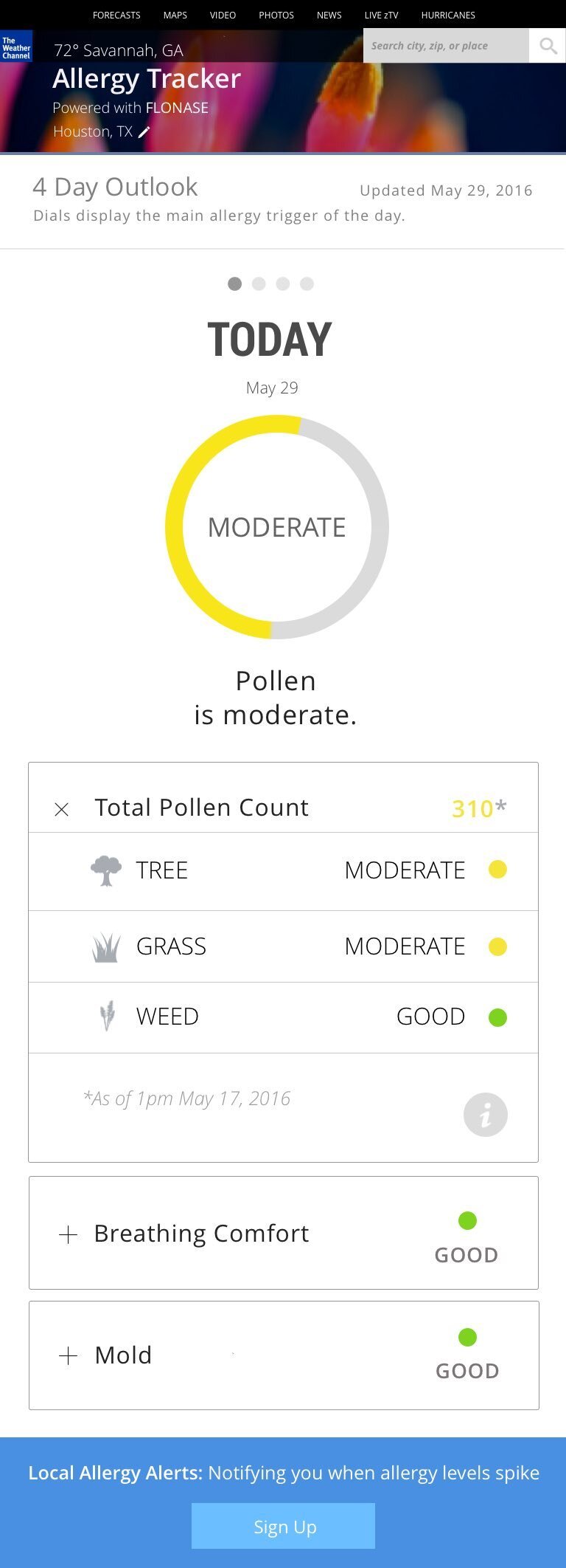
As the UX Art Director for the Weather Channel's flagship app, I led the curation of brand images, enhancing user engagement with weather updates through captivating visuals. This immersive experience aligned with our brand identity, making weather updates more memorable. Additionally, I consulted on the UI design for the Weather's Allergy Tracker, ensuring a user-friendly interface for simplified allergy tracking. Our dynamic tool provides instant insights into allergies, eliminating the need for tedious note-taking and offering comprehensive graphs for easy understanding, especially during peak seasons.
Weather Channel-Mobile AP
As the UX Art Director for the Weather Channel's flagship app, I curated location-triggered images, offering users personalized experiences based on their whereabouts. This involved negotiating with photographers and collaborating closely with engineering and product teams to ensure seamless integration. We enhanced user engagement by triggering images that matched the customer's location and current weather conditions and provided relevant visual content tailored to their surroundings.
